In the past, web design professionals endeavored to show their skills and portfolios by filling their sites with illustrations and tape-à-l'oeil animations which were supposed to impress visitors. Then appeared the “skeletal design”, which tries to bring real life on the screen, with falsely realistic textures, raised shadows and characteristics of real objects. This gave way to flat design, which opposed all these “artificial” design techniques to a more simplified classic digital aesthetic. Although this user -centered web design style has existed for many years, it is still as relevant and popular and has a resurgence in the design of logos in particular. If you are still not sure what it is, don't panic, this article on flat design will explain everything to you.
What is flat design?
Flat Design has its origins from Bauhaus movementis distinguished by his flat style,, functional And minimalist. This artistic movement, emerged in Germany at the beginning of the 20th century, emphasized simplicity, functionality and Reduction of forms to their essence. These principles have influenced many areas of design, including flat design which is characterized by its refined aesthetic, the use of bright colors and the absence of superfluous decoration. This filiation with the Bauhaus underlines the historical and cultural importance of flat design in the landscape of contemporary design.
What is flat design?
Flat design is a user interface design style that uses simple and two -dimensional elements as well as bright colors. Its popularity has increased with the release of Windows 8, Apple iOS 7 and Material Design from Google, all of which use flat design.
Originally, flat design was developed for responsive design, where the content of a website adapts according to the size of the device of the device used. Thanks to the use of simple shapes and minimum textures, flat design guarantees that responsive works well and quickly takes care of. By reducing the quantity of “graphic noise”, flat design offers users a simplified and more optimal experience.
However, despite its popularity, flat design also has drawbacks with regard to the user experience. The absence of three -dimensional effects (for example, the shadows carried) removes the indices that indicate how a user can interact with an element. For example, buttons do not distinctly appear from the other visual elements of a web page, and therefore do not seem clickable. Due to this danger, flat design is increasingly applied in a balanced way, often called “flat design 2.0” or “almost flat design”. This trend takes up the clean and simple visuals of flat design and adds some subtle touches such as color variations and shadows. The visual variety therefore increases and the ease of use improves for the visitor. For example, the Material Design Interfaces of Google and Apple iOS use the shadows and/or the effects to make use more intuitive.
What you can learn from flat design
The flat design returns to the foundations of design as a functional tool. A website is designed and judged according to its proper functioning, not its appearance.
This raw functionality obliges to emphasize the user experience, so that the websites that use this successful design style are likely to receive positive comments linked to conviviality.
What advantages to using flat design?
Here are some of the reasons why websites use the principles of flat design obtain such good results from their audience:
- Flat design is more responsive.
- It has a real resistance capacity, which allows designers to create more scalable websites.
- You can use the flat design regardless of the niche in which you are.
- The tendency to a flat and neutral typography allows better readability.
- The elements designed simply are easier and faster to understand than the super detailed graphic elements.
- Recognizable icons effectively guide visitors in the user interface while preserving space.
- Intuitive interfaces and without distraction improve the navigability of the site.
- The strategic use of color, contrast and hierarchy improves the commitment and conversion of visitors.
- Many of its properties (for example, minimum user interface, simple font style, very contrasting colors) are useful for designing accessible interfaces.
- Minimum designed websites tend to reduce the load imposed on the server, thus improving loading speed.
In summary: the flat design is not content to look modern and clean, it also helps websites to be more efficient.
To design an effective “flat” site, all design elements must be centered on this idea of simplicity. United and lively colors give design the importance necessary to distinguish them instead of illustrative details; Typography without wheelbase brings a net and precise complement to the illustrations; The text is concise and precise; The elements of the user interface such as buttons and links are clear and visible.
Everything must be designed for the same purpose, in order to create a coherent, visual and functional web design. You will find below some concrete examples.
Evolution to Semi-Flat Design
The evolution of flat design to the Semi-flat design represents a response to criticisms of flat design pure, especially in terms of usability. Semi-flat design, while retaining the basic principles of flat design, introduces elements like shadows light and degradedoffering a flat effect with no more depth and a more tactile appearance. This hybrid approach seeks to balance minimalism and functionality, offering an aesthetic both modern and accessible. This evolution demonstrates flexibility and capacity to adapt flat design to the changing needs of users and creators.
Some examples of flat design design
Burger King
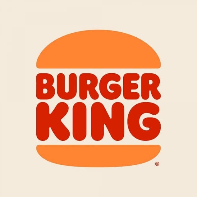
In early 2021, Burger King made a rebranding and its new logo is a reference in terms of flat design. Its website has been redesigned accordingly and uses simple illustrations and icons to guide users on the site. The application also adopts an equally rational approach.
Tripfinder
This travel planning application allows you to easily reserve a flight according to the available packages and budgets. Everything is clear and understandable, and the design is mainly based on colors and icons to give meaning. The copy is concise, and the appearance of the user interface for the search for the ideal flight is user-friendly.
Netflix
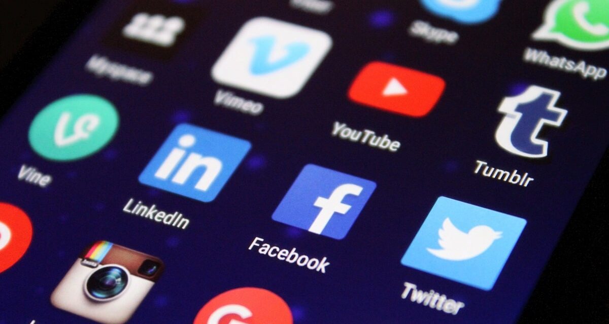
The Netflix website is an excellent example of flat icons at work. To start, the “Play” and “more info” sections are accompanied by icons. It is not only a small attention to detail, these visual markers are intended to accelerate the search process for visitors. Also, let's not forget the colors of the call-to-action “play”. The white button, which opposes the rest of the dark theme, is clearly distinguished and therefore improves the user experience.
Anne Klein
Anne Klein's e-commerce site does an excellent job using the grid, white space and symmetry to create an online store where you can easily navigate. There is also a lot to say about the choices of sleek design – from elegant typography to the bottom white – which really allow colorful images to appear.
Instagram has Review his logo In 2016, going from a richly detailed design to a flat design logo. This new logo, with its gradient of colors and its simplified shape, embodies the refined aesthetics And modern flat design, while remaining immediately recognizable.
Starbucks
The logo of Starbucks has evolved towards a flat design style in 2011, abandoning the name of the brand and complex details For a more refined design. This logo, centered only on the siren, illustrates the effectiveness of flat design in the creation of a powerful symbol and immediately identifiable.
Flat design vs skeuomorphism
Flat design is positioned in contrast to the skeuomorphism. While skeuomorphism imitates real textures and objects to create a feeling of familiaritythe flat design opts for a more minimalist and abstract approach. This trend is manifested by user interfaces stripped of any superfluous ornament, favoring clarity and functionality. This parallel between the two styles highlights the philosophy of flat design: Simplify design to improve User experience And Modernize the aesthetics.
