The thoughtful implementation of CTA is essential for the conversion of visitors, highlighting how their design, positioning, formulation and strategic monitoring contribute directly to the efficiency of a website. Each element, carefully designed, plays a vital role in the user's commitment, influencing click and conversion rates.
The CTA is the acronym of Call to action. He calls the Internet user to act. It is in the form of hypertext link Or button on the strategic pages of your website. To optimize the ability of your site to convert visitors, it is extremely important toImprove your CTAs. To do this, you can optimize his appearance, his relationship with the rest of the page or his wording.
We explain all that to you!
Optimize the appearance of its CTA
Button
The first thing to do to improve your CTA is to make sure it has A button form. For what ? Because it is important that the internet user directly notices that this is a Clickable element.
Before, the tendency of the shadow range to give an impression of 3D helped to identify the CTA as a button. But today the trend is at flat design … Button rectangular And rounded corners.
Of course, nothing prevents you innovatebut keep in mind that Internet users are already accustomed to this design.

Choose the right s)
In order to draw attention to your CTA, you can simply bet on the contrasts and colors. By opting for a light color on a dark background or vice versa, you are sure to bring out your button.
Typography
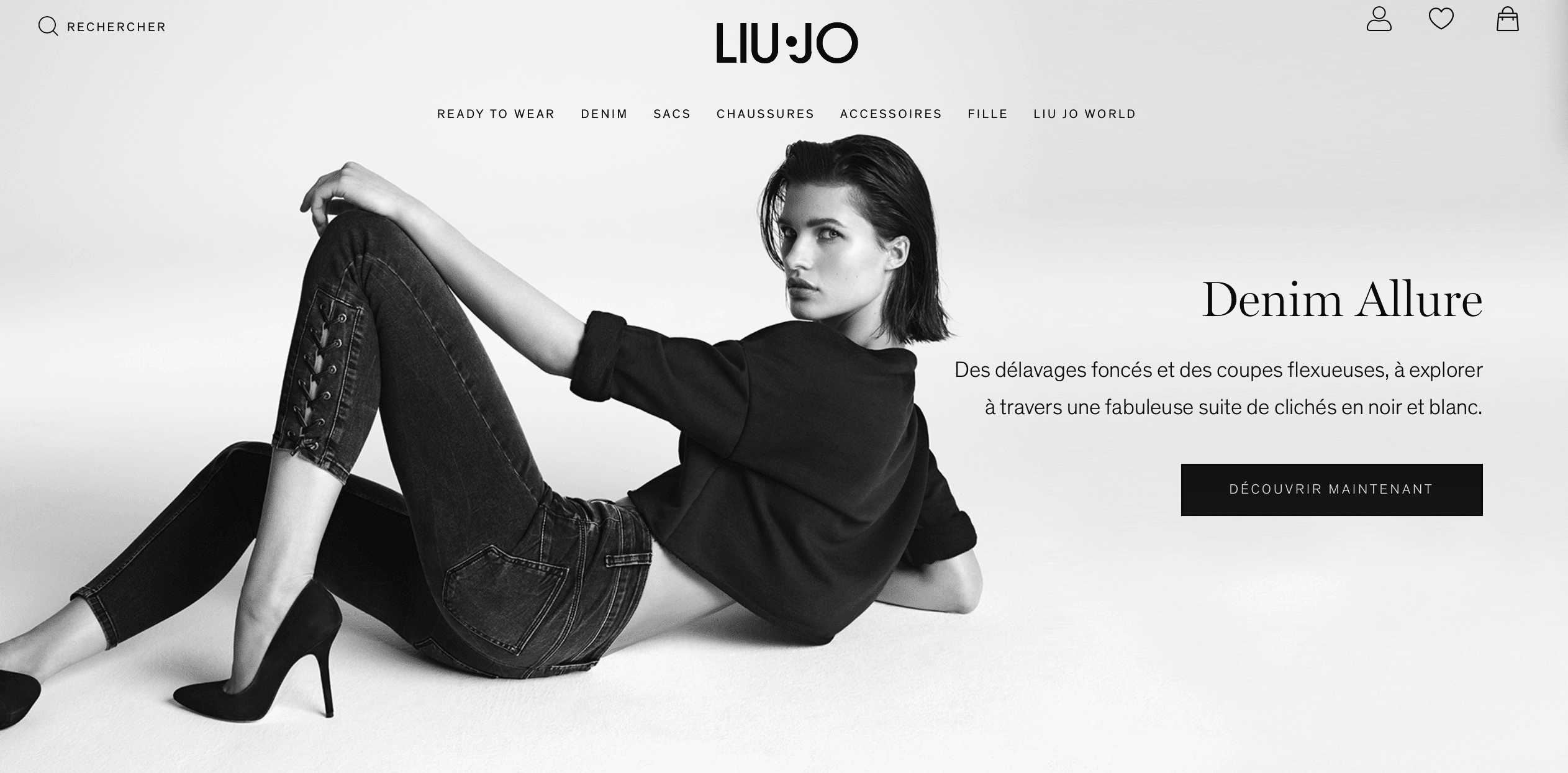
In addition to playing on colors and contrasts you can play on Typographies.
Indeed, you can choose a different typography from the rest of your page, provided you do not upset theHarmony of your page. She must remain Pleasant to the eye.
Otherwise, you can also play on the Text color of your CTA. Here again, we will have to ensure the Good color association in order to guarantee a certain visual consistency within the page.
Optimize the relationship between the CTA and the rest of the page
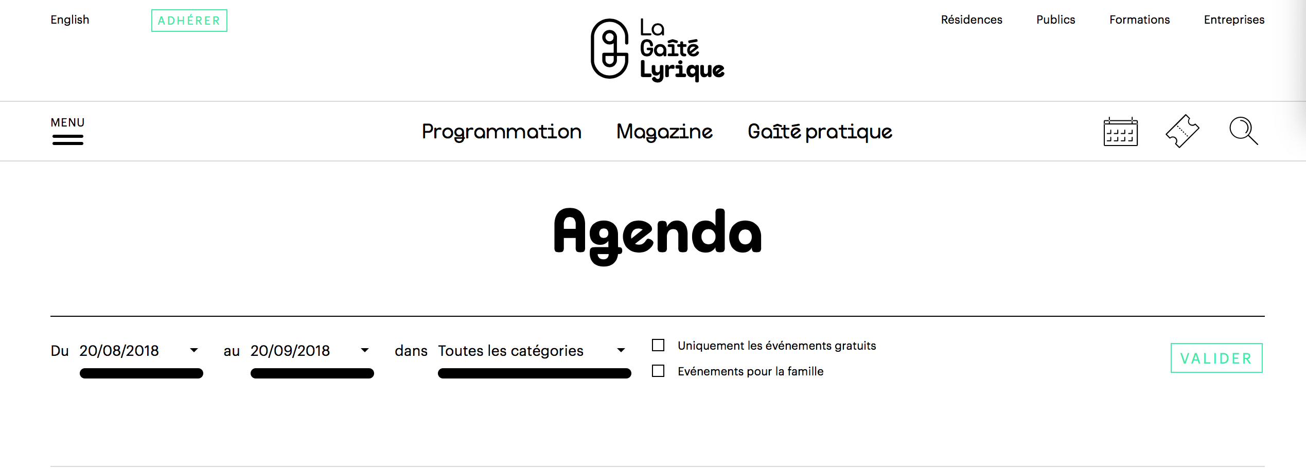
Use the negative space
By leaving a negative space, that is to say a empty spacearound your CTA you put it forward. You make it even more visible to the eye by bringing it out.
So do not hesitate to leave a little negative space between your CTA and the other elements of your page. Guaranteed effect, we promise you!
Choose a choice location!
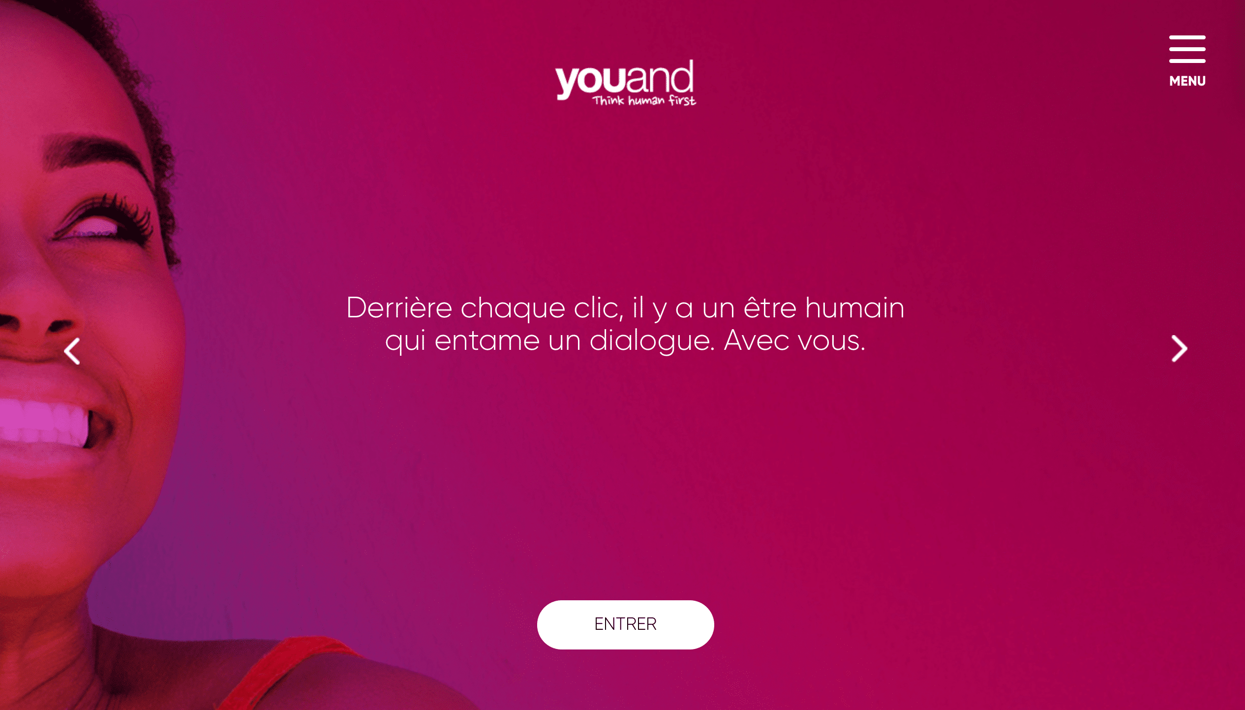
You can imagine! To improve your CTA, you have to choose a choice location. You must therefore place it in a visible area. The best is to place it so that it is part of the First visible elements by your visitor.
This is why we recommend that you place it above the flotation line. So you can be sure that the Internet user's eye will notice it directly.
Integrating CTA into the main content of your site is another effective strategy to encourage interaction without interrupting the user experience. These CTAs must align themselves naturally with the content so as not to seem forced or out of context. For example, a CTA placed in a blog article on digital marketing could invite readers to download a free e-book on the same subject. This non -intrusive approach ensures that CTAs are relevant and add value to the global user experience.
You can also place CTA at the end of blog articlesafter consuming the content, readers are often looking for a next step or an additional action. A CTA at the end of the article can act as a natural guide to this next step, whether it is a newsletter, download a guide, or read a related article. This strategic position capitalizes on the interest and commitment of the reader, thus increasing the chances of conversion.
Finally, the Floating or fixed CTA offer continuous visibility, even when the user scrolls the page. These types of CTAs are particularly effective because they remain in the user's field of vision, thus increasing the chances of clicks and interaction. Whether it is a fixed contact button at the bottom of the screen or a floating CTA which follows the navigation of the user, these elements must be designed so as not to interfere with reading while remaining sufficiently visible. The objective is to facilitate access to the desired action without disturbing the user experience.

Use the content of your page to highlight your CTA
Yes, it is true that since the start of this article you are told that your CTA must stand out. He must appear as the most sparkling star of your page: he shows the direction to be taken. That said, that does not mean that it must overlook the rest of the page. In reality, he mustUnite with the rest of your page In order to push the user to act.
The goal is therefore to put your content on so as to what it directs naturally the user to your CTA.
Choose your CTA Wording well
Reassure the user on the financial issue
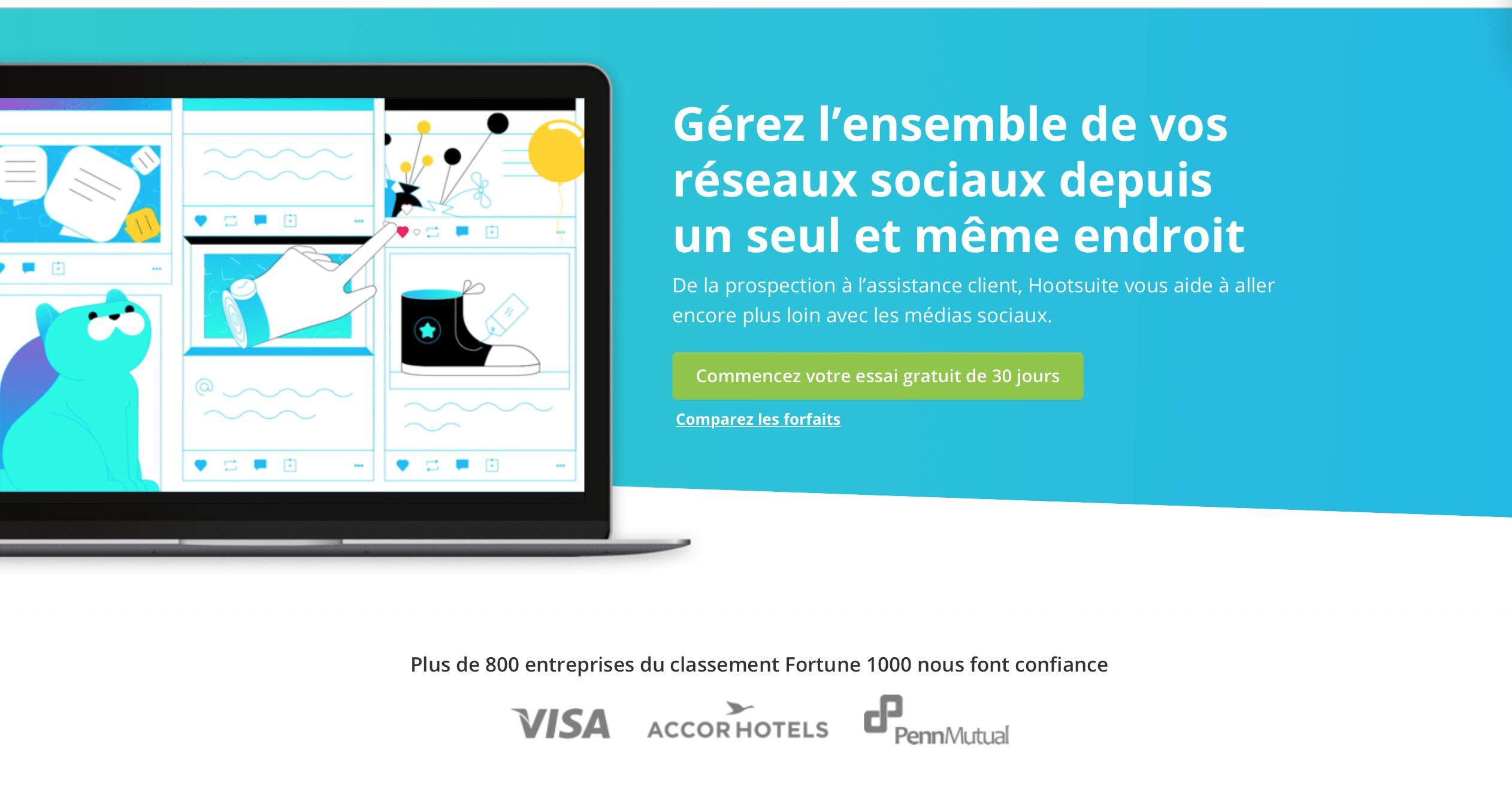
When a user clicks on a button, he often wonders if his action will be free, whether to enter a credit card number or get involved. To push him to act, and therefore to click, reassure it !
Specify directly that it will not cost him anything (if this is the case). You will notice that we often find “without credit card” in the wording of CTA. It's not for nothing! So insist on the freeness. This reassures the user and helps to convince him, to encourage him to click.
Play on the concept of ephemeral
Create an emergency In your CTA thanks to details like “today”, “now”, or with a countdown, pushes Internet users to act up. The idea of a Limited offer in time often encourages to act directly and creates desire and interest.
Use action verbs
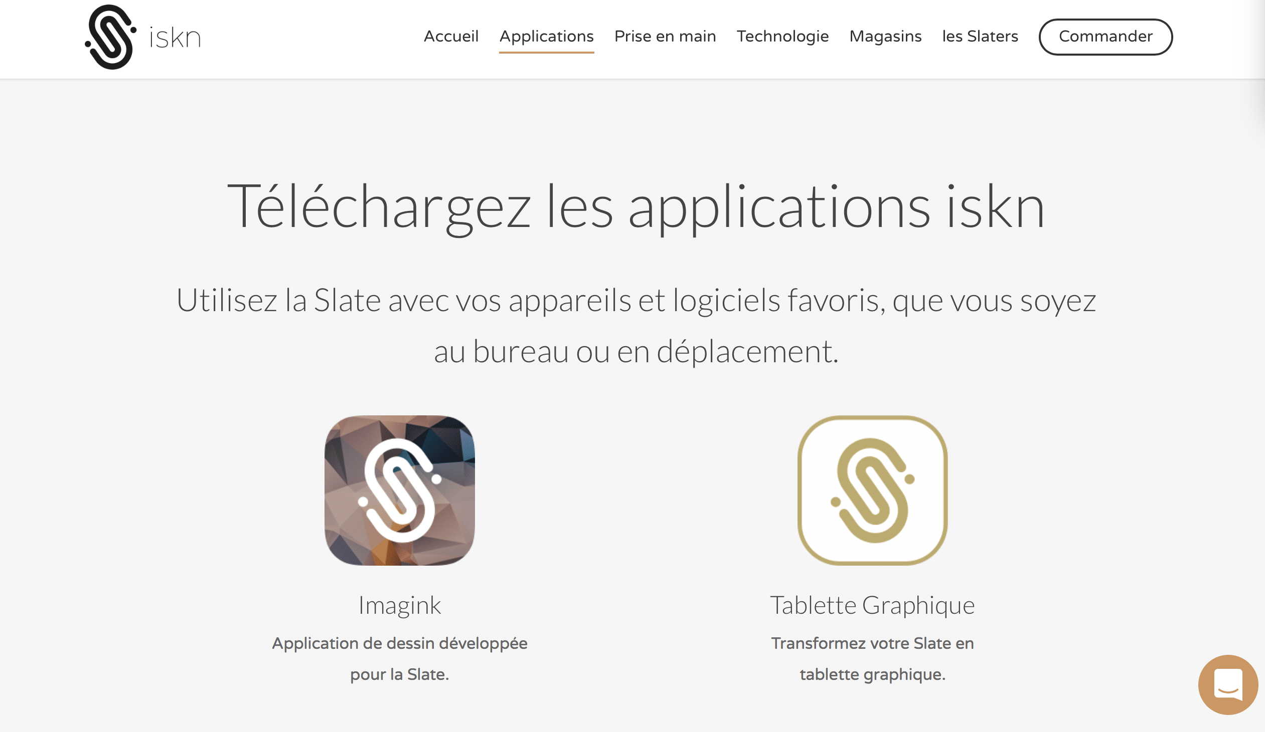
Action verbs are the cornerstone of a Effective call-to-action. They serve as a catalyst for action, directly encouraging the user to act. These verbs must be chosen with care to create a feeling of immediacy and dynamism. Consider these examples:
- “” Discover »: This verb evokes curiosity and invites exploration. It is ideal for encouraging users to find out more about a product or service.
- “” Start »: This verb suggests an immediate action and a new start. It is effective in encouraging users to start a free trial or engage in a process.
- “” Join »: This verb creates a feeling of belonging and community, perfect for encouraging to register for an event or to join a program.
Use negative words
Negative words, when used judiciously, can be a powerful psychological tool in the formulation of CTAs. They play on the fear of missing (Fomo – Fear of Missing Out), a lever psychological which encourages action to avoid a negative consequence. Here's how to use them:
- “” Avoid »: This word creates a feeling of emergency and prevention. For example, “Avoid current errors” can encourage downloading a guide or a white paper.
- “” Do not miss “: This expression stimulates the action by playing on the fear of missing out on an opportunity, as in” do not miss our exclusive offer “.
The use of negative words must be balanced and strategic. Too much negativity can discourage users, while measured use can create a feeling effective.
Monitoring and testing
The success of the call-to-action (CTA) is crucial for the conversion of visitors to customers. For this, rigorous follow -up and regular tests are essential. Let's take a closer look at how these elements can transform your CTA into powerful conversion tools.
Conversion rate
The conversion rate is a key indicator of the performance of your CTA. It represents the percentage of visitors who made the desired action after clicking on a CTA. A low conversion rate may indicate a problem in the design, placement or message of your CTA. To improve it, consider the following aspects:
- Relevance: Make sure your CTA is in line with the interests of your target audience.
- Clarity: The message must be clear and direct, without room for ambiguity.
- Visibility : A well -placed CTA is a CTA that converts. Test different locations to find the “Sweet Spot”.
Click rate
Another essential indicator. It measures the percentage of clicks compared to the total number of views of the CTA. A high CTR means that your CTA is attractive and encourages action. To optimize your CTR, take into account:
- Attractiveness: Use colors and shapes that stand out without being aggressive.
- A/B Testing: Compare different versions of your CTA to identify the one that generates the most clicks.
A/B test
The A/B test is a essential method To optimize your CTAs. It consists in creating two versions of the same CTA, modifying a single element at a time (such as color, text, or shape), then measure which best performers. This iterative process allows you to refine your strategies and optimize conversion. A/B tests can reveal unexpected insights on the preferences of your visitors.
Heatmaps
Heatmaps (heat cards) are visual tools Who show where visitors click the most on your page. They can reveal hot areas where a CTA would be particularly effective. By analyzing the Heatmaps, you can adjust the location of your CTAs to maximize their visibility and their efficiency.
The CTAs are essential to maximize your conversion rate: the success of your site depends on it! An overhaul of your website will also make it possible to best convert your leads into customers.


