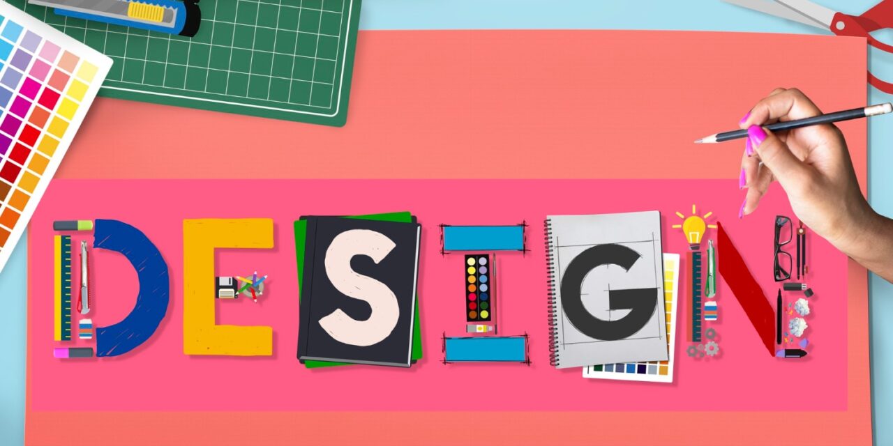
Introduced in 2014, the directives Material Design have become signing websites and services based on Google applications. They are immediately recognizable as being Google affiliatedwhich is an asset for the brand image of the company. The Material Design has also been adopted by the designer community in the broad sense and it is now found on websites and applications far beyond the native Google platforms. Simplenotefor example, uses an aesthetic Material Design In its applications for desktop computers and mobile platforms. In this article, we will precisely define what the ” Material Design » And see how it is used.
What is Material Design?
Material Design was Created by Google In 2014, in particular by drawing up the layout used in Google Now.
Like most design systems, the Material Design was created to offer a unified user experience on various devices, platforms and entry methods. In the same way that Apple has made flat design principles its standard, Google used Material Design to ensure that, whatever the mode of access to its products, users benefit from a coherent experience.
Material Design has directives for absolutely everything: typography, grids, space, ladder, color and imagery. But the Material Design is not content to tell the designers what their sites should look like. It allows them to create conceptions with a hierarchy, a meaning and An objective to find absolutely in the final result.
Differentiation of your brand as part of the Material Design
Today, Internet users understand perfectly how to navigate an application or operating system. They don't need each application to offer the same experience. They can, even unconsciously, move away from the marks that are “boring” during their navigation.
So that your website or mobile application remains visually attractivetry to use these few guidelines:
Choose concepts : Nothing says that you should follow word for Material Design's guidelines. Find the elements of conviviality that have a meaning on modern devices and associate these design concepts with a unique interface experience that leaves the beaten track. Make sure each page for the user reflects your brand.
Do not neglect the functionality for the benefit of the form : A current trap of the Material Design is to choose the form to the detriment of the functionality. This means that some designers use the aesthetic directives of the Material Design and ignore the usability recommendations. They want to give the appearance of a modern website without really modifying the user experience to match visual printing. In the world of digital design, if a website seems user -friendly, it must be! <
Trust your design experience : Google very often has good ideas regarding UX and UI, so it is always good to use their design as a reference point. However, it is you who best know the characteristics of your users and your brand. Trust this knowledge to guide your global approach to design. For example, The Material Design sometimes uses flat pimples to streamline The page, but this can be confusing in terms of interactivity. Leave aside the elements that may be confusing and complex animations if you think they can harm conviviality.
Go to the heart of the Material Design : The next time you examine the Material Design philosophy, eliminate all the superfluous details. Basically, it's about mixing the best in the real world and the best in the world digital in a transparent interface. Take the essential ideas, but establish your own design rulesdepending on your audience.
Consult the sites of your competitors : Do your sites look alike or are the elements sufficiently contrasting to create a different brand experience? You must include information that corresponds to the level of detail provided by your competitor, but the general aspect of the site should not be similar.
Find a valid reason : Do not use elements of Material Design that if you have a good reason to do it. Do you really need to add depth or use a floating call to action? If the more element does not improve the user experience or the interface, go to a static or flat element that will meet the real needs of your user.
Continue to invest in your own apprenticeship : Attend seminars, take courses and continue to read on the wider concepts of the UI and the UX instead of only counting on the Material Design. Although it is an extremely popular philosophy, the Material Design as we know him will end up evolve. It is therefore essential that you are not late compared to the basic philosophy, namely the creation of a quality user experience.
Listen to user comments : If you are not constantly in the environment of the end user, you will not always notice the small inconsistencies that negatively affect their global experience. Your users, on the other hand, can give you important indications on what works and what does not work. Ask And listen The real experiences of users as you advance to make sure you are on the right path.
Some examples of Material Design
Think with Google
It is not surprising that a website managed by Google is one of the examples presented here. There are a number of elements that Think with Google uses from its design system:
- A design based on a grid for a content flow regular and predictable.
- Shadows that create a contrast between layers and help visitors to identify The different parts of the page to consult.
- A minimum design with bright color contrasts for attract attention to calls for action.
Elementor
If you didn't notice it, the Elementor website is based on a large number of principles of Material Design ::
- The most important buttons on the page are designed to look like clickable elements and are transformed to provide visitors with confirmation that “Yes, you can click here. »»
- Other notable elements (such as layout, typography and colors) are placed on an upper layer so that visitors Notify them Before moving on.
- The animation is realistic, so that visitors see only graphics that move in an expected way. They always draw attention, but do not divert the attention of the rest of the content.
Hotels.com
Although the website on Hotels.com desktop does not exactly adhere to the principles of Material Designits mobile site does it:
- Lines of clear demarcation separate each element from the search results page, which allows visitors to easily visualize The corresponding hotels, one by one.
- The transition from the view to the card view shows how the Material Design helps designers from websites to create experiences more user -friendly for visitors.
- In the plan view, the “see more properties”, “list” and zoom buttons are easy to distinguish because they are placed on a layer above the card.


